For the 2022–23 school year, my high school added a brand-new course, never taught before in any school, that would be required for sophomores. It would be a semester-long course, with the remaining semester being filled by a second semester of Health. They called it Sophomore Inquiry, or 10th Grade Inquiry, given that the semester-long complement to Health 1 is called 9th Grade Inquiry. Until the beginning of the year, only the two teachers who would be teaching it knew exactly what it entailed.
The reaction to this was less than positive, especially by the incoming sophomore class. Most of us had been expecting to enjoy an extra semester of elective space and were disappointed when that was filled by a course that seemed to be the continuation of a not-very-interesting one from the previous year. Nonetheless, we were all gradually astounded by the uselessness of the course that the school’s administration had decided we needed to take. It seemed no more than a slightly-more-advanced English class with a specific focus on the “inquiry process,” with the only two graded assignments being an annotated bibliography, due mid-way through, and a research paper of substantial length, due at the end of the semester.
In order to prove this point, I surveyed 40 of the 200 or so students who took the course during the first semester (I had hoped to get more submissions, but the teachers’ choice of language impeded that), and analyzed the data I received. I didn’t know what I would find, and the results surprised me, but they support my claim that the class does not achieve what it attempts to.
A note on quantification: the information I received from survey respondents was mostly in the form of text. It asked questions like, “In your English class this year, how much have you studied argumentative essay writing?” and allowed the respondent to choose from “a lot,” “some,” “a little,” or “none.” In order to properly utilize this data, I converted those responses to 3, 2, 1, and 0, respectively, and substituted in a value of 1.5 (the ‘average’ point) if no answer was given. Some questions asked to rate something from 1 to 10, in which case I could directly use the response as the data; others asked for comments, which are harder to quantify and have been left out of the data analysis.
Three times, survey respondents were asked to measure their success in a given class—in freshman English (English 1-2), in sophomore English (English 3-4), and in Sophomore Inquiry. They were also asked to rate their “general ability in English,” before answering any other questions to minimize personal bias. All of these were on a scale from 1 to 10.
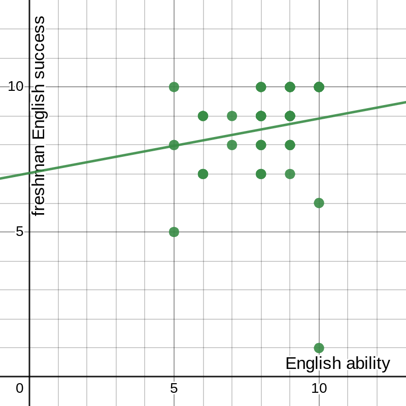
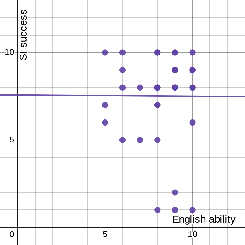
I first plotted each of the success responses against English ability. I expected to find a noticeable, if not terribly significant, correlation. Instead, they seemed utterly random (using freshman English as an example; they all looked similar):
figure 1: respondents’ success in freshman English vs. general ability in English
The students clearly hold both their current and former selves in high regard (or, at least, all but one do), but no obvious correlation appears between these two sets of data. The way to check this is to perform a linear regression, also known as least-squares regression.
We begin with an assumption. Assume that the line of best fit, which we are trying to find, is defined by , where (, ) is the mean point. This works because the mean point of the data set must always lie on the line of best fit. Then for any point in the data set (, ), the error in the line of best fit is the vertical distance between the line and the point, or . Our goal then is to find the value of a that minimizes not the total error, but the sum of the squares of the errors. I have assumed here that the point lies below the line and , in order to make the error positive, but this ends up being unimportant because the error is squared. In order to find the minimum total squared error, now, we have to do some calculus.
The First Derivative Test is a principle that says that when the derivative of a function is equal to 0, the function must have a local extremum (maximum or minimum) at that point. Therefore, assuming there is a single best best-fit line, we simply differentiate the expression for the sum of the squared errors to find the correct equation. The value we want to minimize is , whose derivative, using the Chain Rule, is . We set this equal to 0, then solve for a: a giant mess. I could solve this by plugging in every value of and , as well as and , but that would take way too long. Thankfully, there is a shortcut.
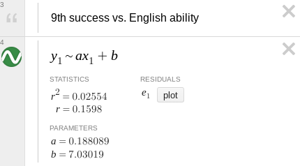
Because this problem has been solved many times before, there are known equations to find the line of best fit in this scenario, though they are rather complicated. They also require first revising our function. Instead of expressing it in point-slope form, as , we can call it (notice that these are equivalent, where ). We can then calculate the parameters using the equations and , where n is the number of data points.[1] For my 41-point data set, , , , , and . Therefore 0.188 and 7.0302. Our line of best fit can be expressed, therefore, as .
We can use similar properties to find the correlation coefficient, which is a measure of how closely the line fits the data. This value is given by the nasty-looking equation .[1] The nice thing about this equation is that we have already calculated most of the relevant values, and the remainder are relatively simple: and . This gives 0.15892. It so happens that the more useful quantity is r2, which better represents the data’s spread, giving us 0.02554, also known as “too small to be statistically significant.” The result we find is exactly what we predicted simply by looking at the data: there is no meaningful correlation between these two sets of data.
Before I’ve even started on those calculations, a calculator could tell me all of those numbers, and plot the line of best fit over the data:
figure 2: graph of data and best-fit line with parameters
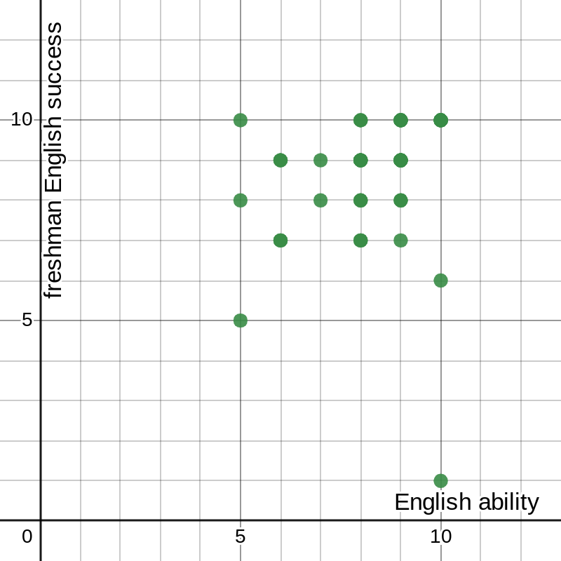
And, without needlessly running two more rounds of dull calculations, I can have it reach the same conclusion for two more sets of data:
figure 3: graph of success in sophomore English vs. general ability in English with best-fit line and parameters
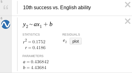
figure 4: graph of success in Sophomore Inquiry vs. general ability in English with best-fit line and parameters
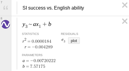
The graph in figure 3, for 10th grade English, looks like it vaguely follows the line, but with it’s still well below the threshold to make any real claims about the correlation.
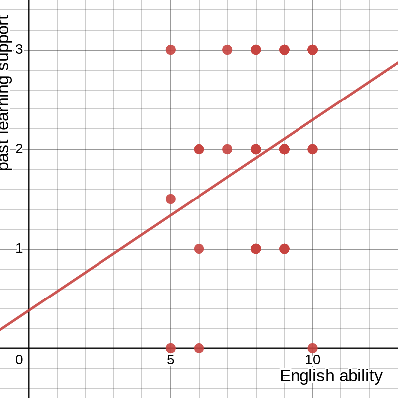
Another question now arises—even though none of these sets for success correlate with the data for general ability in English, could they be correlated to each other? The answer… is still no. The same process we just followed tells us that (without printing more images from Desmos) the r2 values for success in either other class against sophomore English fall below 0.1, though for Sophomore Inquiry against freshman English it creeps up to 0.22. I tried comparing those to yet another set, the responses to the question “How much have past English studies, specifically freshman English, helped you succeed in Sophomore Inquiry?” and found that the highest r2 was just under 0.1 (note that the -axis here is measured from 0 to 3 instead of 1 to 10):
figure 5: graph of past studies’ influence on success vs. general ability in English, with best-fit line and parameters
In short, none of these metrics define one another. They are clearly related in the real world, and it may be logical to expect that some connection would be shown in the data, but there is no statistically significant relationship in the result. But that doesn’t make sense. How is it that students who are better at English (or at least believe themselves to be better at English, which is close enough for our purposes) don’t always, or even most of the time, do better in English class? The reason is that English classes in particular, and other classes to a certain extent, do a bad job of measuring a student’s abilities and potential, as shown by various studies[2][3][4] and anecdotal evidence.[5][6] A student succeeds only if their abilities conform to the teacher’s specific expectations, which are rarely broad enough to include everyone. Sophomore Inquiry is a glaring example of this: although the average survey respondent said that past studies had “some” effect on their success in Sophomore Inquiry, they rated this success a whole point lower than their success in freshman English and about three-fourths of a point less than their ability in English. This does not necessarily mean that the students performed no better than if they had never taken an English class before, but it does show that Sophomore Inquiry allows students less room for success than other classes.
At the beginning of the semester, my teacher for Sophomore Inquiry said he had four goals in mind when he created the course, four reasons for doing so. The first three were really one—to teach students how to navigate the up-and-coming world of the Information Age, in relation to “information overload,” the barrage of online messaging directed at our minds every day; fake news and “truth decay,” how the public’s trust in the media has gone from completely out the window in the past few decades; and “information intended to deceive,” known as misinformation and disinformation, or why nobody really knows what facts are anymore. The fourth was slightly more straightforward—to prepare sophomores for the IB program, in which all juniors and seniors participate to a greater or lesser degree. There was only one issue with all of this: it never really happened. A few classes at the beginning were dedicated to a brief introduction to misinformation, fake news, conspiracy theories, and the like, but the course quickly pivoted to the research and writing part and never looked back.
One measure of this is a simple average, or arithmetic mean, computed as the sum of a set divided by the number of elements in it, or in formal notation. When asked how much each of those four things was a part of Sophomore Inquiry, the average respondent gave an answer between “a little” and “some” for all four. On my quantitative scale (where those two responses became 1 and 2 respectively), the average response to “How much have you learned about ‘information overload?’” was under 1.1; for ‘truth decay’ it was 1.80, for ‘information intended to deceive’ 1.76, and for IB preparedness only 1.56. I expected that last one to be higher than the others, at least, because my experience with the IB program (which is uncommon for a sophomore) let me know how important it is to be able to craft a well-written paper, while the history of the Birds Aren’t Real movement has never come up. I would guess that since the teacher never talked much about IB, and they didn’t really know what it is, the students never internalized how much impact the class’s process would have on their future in high school.
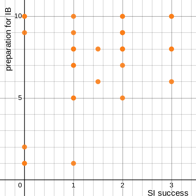
A more comprehensive explanation derives from our old friend linear regression. Instead of using only one set of data to describe a phenomenon, we can combine two to suggest more thoroughly that they are not connected. For example, I can plot the responses from the last of those four questions, about IB preparation, on one axis and self-reported success in Sophomore Inquiry on the other:
figure 6: graph of respondents’ success in Sophomore Inquiry vs. preparedness for IB gained from the course
I can then use the method from the previous section to determine the relationship between these two sets of data. That image makes it fairly clear that there isn’t a very significant one, but an exact answer is always better than an eyeballed approximation.
Without writing out all the equations again, I can compute the sum of each set, the sum of the products for each data point, and the sum of the squares of each set, and conclude that 1.146, 5.723, and 0.409 (and ). Again, we can arrive at the same conclusion by using a calculator:
figure 7: graph of success in Sophomore Inquiry vs. gained preparedness for IB, with best-fit line and parameters
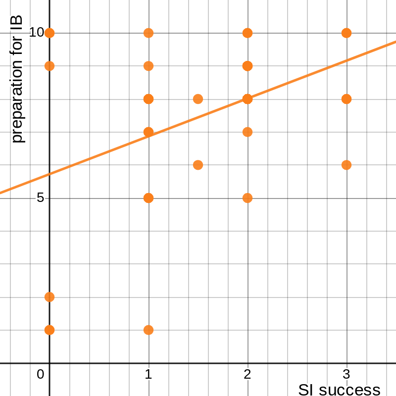
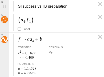
A correlation coefficient this small is not sufficient to make any claims about the connection between these two sets of data. The same thing holds for the other three of the four goals: regardless of how much respondents claimed to have learned about those things, or done well in those areas, that mathematically did not help them do well in the course, with two of the r2 values under 0.1. So, what did?
In order to try to identify the main factors for students’ success in Sophomore Inquiry, I compared ten different sets of data. Two of these were referenced earlier, the responses to “How would you rate your overall success in Sophomore Inquiry?” and “How much have past English studies, specifically freshman English, helped you succeed in Sophomore Inquiry?” The others were the responses to four questions aimed at gauging the content of freshman English and Sophomore Inquiry: for each class, “How much did you study argumentative essay writing?”, “Over the course of the year, how much did you study citing sources and/or MLA formatting/style?”, “How much did you study identifying sources and gathering evidence for an essay?”, and “How much did you study PEAS paragraphs (or similar paragraph-structure topics)?” I then compared this data using three different linear regressions—success in Sophomore Inquiry against content of freshman English, influence of past studies against content of freshman English, and success in Sophomore Inquiry against content of Sophomore Inquiry.
Unfortunately, I cannot show this data, for the simple reason that it exists in five dimensions. This, of course, makes linear regression rather difficult. There are known formulae for the process in two dimensions because it is a fairly straightforward thing; even if there were such equations for the five-dimensional process, they would be too complicated for me to understand. I will reveal the results of this process, which is easy for a calculator, later on, but first I will attempt to show how regression works in higher dimensions.
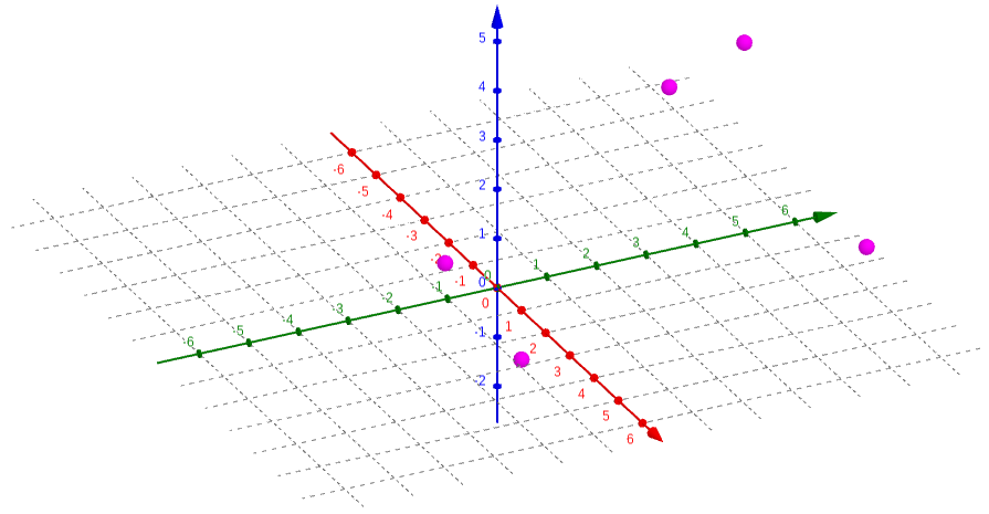
We begin with our data. Because the forty points in my data sets are rather unwieldy, I will use a simplified arrangement with three sets of five points each. Let’s say they are X = {1, 2, 3, 4, 5}, Y = {0, 4, 2, –3, 5}, and Z = {–1, 5, 5, 3, 2}; that is, the five points in three-dimensional space are {(1, 0, –1), (2, 4, 5), (3, 2, 5), (4, –3, 3), (5, 5, 2)}. I can graph this using a program specifically designed for 3-D graphs:
figure 8: graph of sets X, Y, and Z as points in 3-D space
This is somewhat hard to visualize simply because I am trying to show three dimensions in two, which is another reason this process is rather difficult. We now want to find a plane , where (, , ) is the mean point of the data set, that minimizes the total squared error in the direction, the same way we did in the first section. We use a plane rather than a line because it can better map the data in three dimensions. The error at a given point (, , ) is defined by . We want to find the sum of the squared error for all points, which we can write as . This looks needlessly complicated, but that’s only because we haven‘t put in any numbers yet.
We first need to find the average point. We know that each of the coordinates of this point is the average of the corresponding set, so we find that , , and . Then, we write out each term of the sum above. Our five points are {(1, 0, –1), (2, 4, 5), (3, 2, 5), (4, –3, 3), (5, 5, 2)}, so if we call the total we are looking for E, we get . Squaring all these trinomials is rather messy, but it simplifies to . I stopped before going even this far in the first section, and I think it is now clear why: it may not be difficult math, but doing the same thing forty-one times takes a lot of time (not to mention a fair amount of paper). With only five points, it is a bit quicker, but we also have some difficult math to do—multivariable calculus.
In two dimensions (what is called calculus in one variable), we have the concept of a derivative, sometimes called the “slope at a point,” which expresses the instantaneous rate of change of a function with respect to its input. For a function in terms of , this is (informally) how fast changes as changes. This can be extended to multiple dimensions in different ways, but the simplest is the gradient. The gradient is expressed as a vector, with one component for each input, where each component is the partial derivative of the function with respect to the corresponding input variable; the partial derivative is the derivative of the function with respect to only one of the inputs, assuming all others are constant.[7] For example, for the function , the partial derivative with respect to is and the partial derivative with respect to is . (The character ∂ is sometimes pronounced as “partial” but has no standard pronunciation, and it is used to distinguish the partial derivative from the normal derivative. Confusingly, it is also sometimes pronounced like the letter D.[8]) The gradient of f, then, is simply the vector with these two components: or 2i + 6yj. This means that, at any given point, the fastest increase of the function is 2 in the direction for every step in the direction, and 6 times the value in the direction for every step in the direction.
We can use this idea to find the plane of best fit for our data. I mentioned in the first section the First Derivative Test; though we did not use it there, that is what we will need to use now. That principle says that the point(s) where the derivative is 0 are local extrema (fancy mathematician talk for “maximum and minimum”). Extending this to the multi-dimensional gradient, we know that there is some sort of stationary point (more on this later) where the gradient is equal to the zero vector, or ⟨0, 0⟩. We want to minimize the squared error for our function, which means minimizing the value of . We do this by calculating the partial derivatives of this function with respect to each of a and b and setting both equal to 0: and , so and . Solving this system of equations gives 0.3449 and 0.1836, so our best-fit plane is , or . Alongside the points, that looks something like this:
figure 9: graph of points in 3-D space with plane of best fit
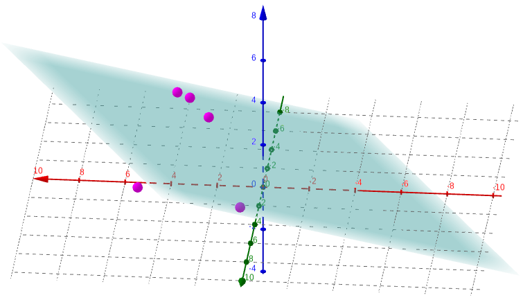
Again, it is incredibly difficult to visualize what this really shows when depicted in two dimensions (frankly, even in three dimensions, it is hard to wrap my head around). But, we have assurance that it represents the closest approximation to the relationship between these three sets of data.
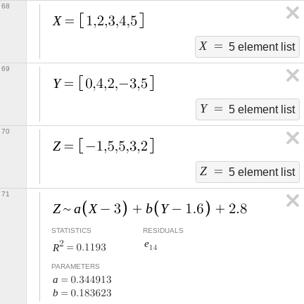
How good is this approximation? To answer that question we need something called the coefficient of determination R2, which is a sort of extension of the r2 value, the square of the correlation coefficient, from earlier. We can calculate this value with only two pieces of information about our data.[9] One of them we already have because it is how we got the values for our best-fit plane—the sum of the squared errors, , which, plugging in the results we got, comes to 21.8412. The other is called the total sum of squares; instead of comparing the actual value at a point to the predicted value, it compares the actual value to the mean value. In formal notation, we would write , where is the average value we found before. Plugging in all the numbers gives . The coefficient of determination is then 0.1193. We can confirm all of these results with the same regression on Desmos:
figure 10: equation and parameters for plane of best fit
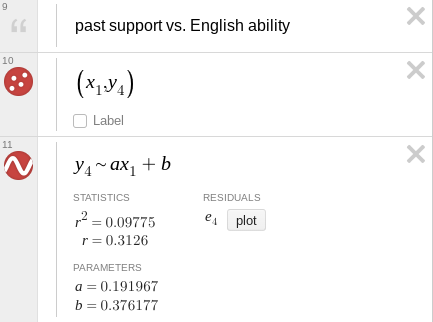
So, after all this stuff about made-up data, what do we know about the real data? The same techniques we just used, now finding a four-dimensional hyperplane in a five-dimensional hyperspace, can tell us similar information about the effects of various study topics in freshman English on success in Sophomore Inquiry. I will not go into the math, as it gets increasingly complicated with more dimensions and more data points, but Desmos can do it much faster. Indeed, it can answer all three of my questions in the blink of an eye:
figure 11: regression parameters for success in Sophomore Inquiry and past studies’ influence on that success vs. presence of four content factors in freshman English
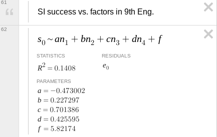
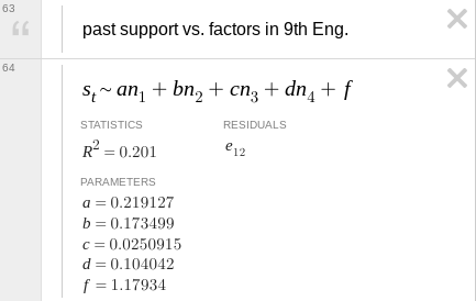
figure 12: regression parameters for success in Sophomore Inquiry vs. presence of four content factors in that class
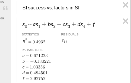
In these images, the four n’s or s’s correspond, respectively, to learning about argumentative writing; citations, style, and formatting; researching for an essay/paper; and paragraph structure; and a, b, c, and d are weights on those values. In the first two, these are for freshman English; in the third, they are for Sophomore Inquiry. f is a balancing constant whose main purpose is to relate the inputs, measured between 0 and 3, to the output, on a scale from 1 to 10.
We can learn a lot from a few numbers. In the two-dimensional linear regression calculations, I focused much more on the r2 value than on the values of a and b. Here, however, the coefficients mean something because we are combining multiple inputs to give a single output. For example, the highest value (not including the constant f) corresponds to the variable that contributes the most to the output. In the first equation, c is the highest, which means learning how to do research for an essay in ninth-grade English probably helped students in Sophomore Inquiry; this makes sense given how a lot of time in the latter was spent on the research process. We should be wary about these conclusions, though. The coefficient of determination for that first equation is 0.1408, which is low enough that the data probably do not align very well with any patterns we might identify in them. Additionally, the constant f in that equation is close to the midpoint of the data set (about 5.5 since it is measured between 1 and 10), which implies that the other variables do not have a very large effect. The only one where we might be able to draw meaningful conclusions is the third one, with an R2 of almost 0.5. We see that, again, learning how to do research was a major player in students’ success, and prior knowledge of how to properly cite sources and format the paper may not have been useful because of the negative coefficient.
No statistical process is perfect, there is always error or bias of some sort. In some cases, this is easy to quantify and account for, but in others it is nearly impossible. For this investigation I can identify some bias, but I cannot quantify it or take account of it in any way other than acknowledging that it exists and moving on. I created a survey having already formed opinions about the issue at hand; the teacher’s acceptance of the survey lends it some credibility, but my own bias probably showed through somehow in the questions. All of the data in this investigation is self-reported by students—there is no objective data such as students’ grades—and only a portion of the relevant population of students at that. Both of those factors introduce error: self-reported data is notoriously off-kilter because humans are bad at evaluating themselves objectively, and the forty students out of two-hundred who chose to fill out my survey are likely the ones who are more interested in the class and thus usually the better students. Additionally, I have chosen to analyze certain aspects of the data, and may have inadvertently avoided analyses that might have supported or defeated my case. I can never know what would have been the best argument without working through every possible data comparison.
The time it has taken me to collect, analyze, and report on the data has already allowed for some interesting developments. All of the survey respondents, myself included, had Sophomore Inquiry first semester, and we were the very first students ever to take the course. Through casual conversation with other students who are taking it second semester, I have discovered that (unsurprisingly) the teachers noticed a few things that they could change to make the class better, or more helpful, or more useful. To obtain more thorough and more complete results, I could survey students from the second-semester class and extend my analysis to that data as well, and I could potentially learn if the changes that were made had any effect on students’ perception of the course. (From what I have heard, the changes were mostly of the “quality-of-life” variety, so I doubt there would be a noticeable difference.) In the future, I could also present the same survey to Sophomore Inquiry students for even more complete data, or to try to identify some change in the results, but I think it likely that I would find no such change nor any advantage to the additional data.
The process of creating this exploration began almost three months ago, when I constructed the survey that provided me the data herein. Though I invoked several high-level mathematics concepts and went well beyond the content of the course to which this applies, I felt that I focused a lot more on the use of language in this paper and the mathematical communication. If I were to do another, similar, investigation in the future, I would focus on analyses that yield viable results, rather than repeated attempts to draw conclusions from data that opposes any attempt to do so; possibly by providing more examples to show concepts instead of actual data (which has a tendency to be less interesting) and constructing these examples with the intention of showing what meaning can be gleaned from them.
In the end, I learned that data analysis is a messy business where the difference between right and wrong often feels like splitting hairs. It seems difficult to find the right data to prove a point, yet it is easy to portray the same data in different ways to paint a different picture. This exploration taught me that some things I thought were wrong and, at the same time, that I had never really considered the truth. I do not know what Sophomore Inquiry will become, nor can I know exactly what students think of it; but I am certain that this analysis will have implications reaching far beyond IB Math Analysis & Approaches. ∎
a b 1. Richard Peterson,
“Linear Regression by Hand,”
towarddatascience.com/
↑ 2. Robert Cortes et al., “Transfer from spatial
education to verbal reasoning and prediction of transfer from learning-related neural change,” in Science
Advances volume 8 issue 32,
doi:10.1126/
↑ 3. Yueqi Shi and Shaowei Qu, “Cognitive Ability and
Self-Control’s Influence on High School Students’ Comprehensive Academic Performance,” in
Frontiers in Psychology volume 12,
doi:10.3389/
↑ 4. Matthew Campbell, “Better Ways to Measure Student
Progress,”
edutopia.org/
↑ 5. Aastha Gupta, “‘My GPA Doesn’t Define
Me’: Why grades are not an accurate measure of intelligence,”
dailycampus.com/
↑ 6. Matthew Lynch, “What Do Grades Tell Us About Student
Ability?”
theedadvocate.org/
↑ 7. “Gradient” on Wikipedia,
en.wikipedia.org/
↑ 8. “∂” on Wikipedia,
en.wikipedia.org/
↑ 9. “Coefficient of determination” on
Wikipedia,
en.wikipedia.org/